
SUMMARY
This article covers how colors are defined in the physical world. It is designed as background reading for the following colorspace articles:
- Q100328: What is a Colorspace?
- Q100319: How to use colorspaces in Nuke?
- Q100327: How do Nuke's internal "colorspaces" work?
MORE INFORMATION
Perceiving Color
The color of an object is determined by the colors of light which hit the receptor observing it, whether this be a camera sensor or a biological eye. The color of light is generally measured by it's wavelength as shown by the diagram below:
This diagram shows the full intensity of any particular color, so you won't get and variations of a color such as pink, as it is a faded version of red. These are known as the spectral colors.
Another way in which colors can be measured is with Hue, Saturation and Brightness, often found in computer applications, and is described by the Musell color system explained below:
More information about the Musell Color System can be found here:
http://hyperphysics.phy-astr.gsu.edu/hbase/vision/colsys.html#c1
Using a light's wavelength is useful for describing the spectrum of colors in the physical world, however the human eye can only see a small section of this, called visible light. The receptors in the human eye which deal with this are the Rod and Cone receptor cells.
In the human eye there are approximately 120 million Rods compared to only approximately 6-7 million Cones.
The above diagram also shows the density of the Rods and Cones within the eye. The central part where the Cone density is greatest is also called the fovea.
The Rods are used for low light/peripheral vision, and are not very accurate with colors and details when compared to the Cones. The Cones provide the eye's color sensitivity, where 64% are used for red (long) wavelengths, 32% for green (medium) wavelengths, 2% for blue (short) wavelengths.
The below graph shows how the different sets of Cones respond to the wavelengths of light:

More information about this can be found here:
http://hyperphysics.phy-astr.gsu.edu/hbase/vision/rodcone.html#c3
Generating Chromaticity Diagrams
Due to the disparity of how sensitive the Cones are to various wavelengths of light, we don't perceive the entire spectrum of colors equally. Knowing this, we can generate a map of the visual spectrum the human eye can see.
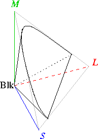
The International Commission on Illumination or CIE (abbreviated from Commission Internationale de l'Eclairage) created such map in 1931. This was done by projecting the short, medium and long responses of the eye into 3D space from a point of pure black to infinity bright (luminance), as shown below:
A cross section of the resulting cone then became the standard for measuring relative chromaticity compared to the human eye (the quality of color, independent of brightness), resulting in diagrams like below. In this diagram the numbers around the curve are the wavelengths of light.
This particular example (which seems to be the most common) was tested with 2 degrees of the angular separation of the fovea (small, central pit composed of closely packed cones in the eye), tests were also done with 10 degrees in 1964.
More information about chromaticity diagrams can be found in the links below:
- https://web.archive.org/web/20190318020837/http://www.efg2.com/Lab/Graphics/Colors/Chromaticity.htm
- https://en.wikipedia.org/wiki/Color_model
- http://hyperphysics.phy-astr.gsu.edu/hbase/vision/colper.html#c1
We're sorry to hear that
Please tell us why